Diamond Price Prediction#

Demo website#

Diamond Price Prediction - Built with Streamlit and deployed on Streamlit Cloud.

Packages#

import pandas as pd
import numpy as np

Import datasets from Kaggle#

This dataset is available on Kaggle at Diamond Price Prediction.

diamond_df = pd.read_csv('data/diamonds.csv')
diamond_df.head(), diamond_df.shape

Hide code cell output

(   Unnamed: 0  carat      cut color clarity  depth  table  price     x     y  \
 0           1   0.23    Ideal     E     SI2   61.5   55.0    326  3.95  3.98   
 1           2   0.21  Premium     E     SI1   59.8   61.0    326  3.89  3.84   
 2           3   0.23     Good     E     VS1   56.9   65.0    327  4.05  4.07   
 3           4   0.29  Premium     I     VS2   62.4   58.0    334  4.20  4.23   
 4           5   0.31     Good     J     SI2   63.3   58.0    335  4.34  4.35   
 
       z  
 0  2.43  
 1  2.31  
 2  2.31  
 3  2.63  
 4  2.75  ,
 (53940, 11))

Eliminate the leftmost column, which is just an index.

diamond_df = diamond_df.drop(['Unnamed: 0'], axis=1)

Data Exploration#

Use describe() to get summary statistics#

diamond_df.describe()

Hide code cell output

carat depth table price x y z
count 53940.000000 53940.000000 53940.000000 53940.000000 53940.000000 53940.000000 53940.000000
mean 0.797940 61.749405 57.457184 3932.799722 5.731157 5.734526 3.538734
std 0.474011 1.432621 2.234491 3989.439738 1.121761 1.142135 0.705699
min 0.200000 43.000000 43.000000 326.000000 0.000000 0.000000 0.000000
25% 0.400000 61.000000 56.000000 950.000000 4.710000 4.720000 2.910000
50% 0.700000 61.800000 57.000000 2401.000000 5.700000 5.710000 3.530000
75% 1.040000 62.500000 59.000000 5324.250000 6.540000 6.540000 4.040000
max 5.010000 79.000000 95.000000 18823.000000 10.740000 58.900000 31.800000
import matplotlib.pyplot as plt
%matplotlib inline

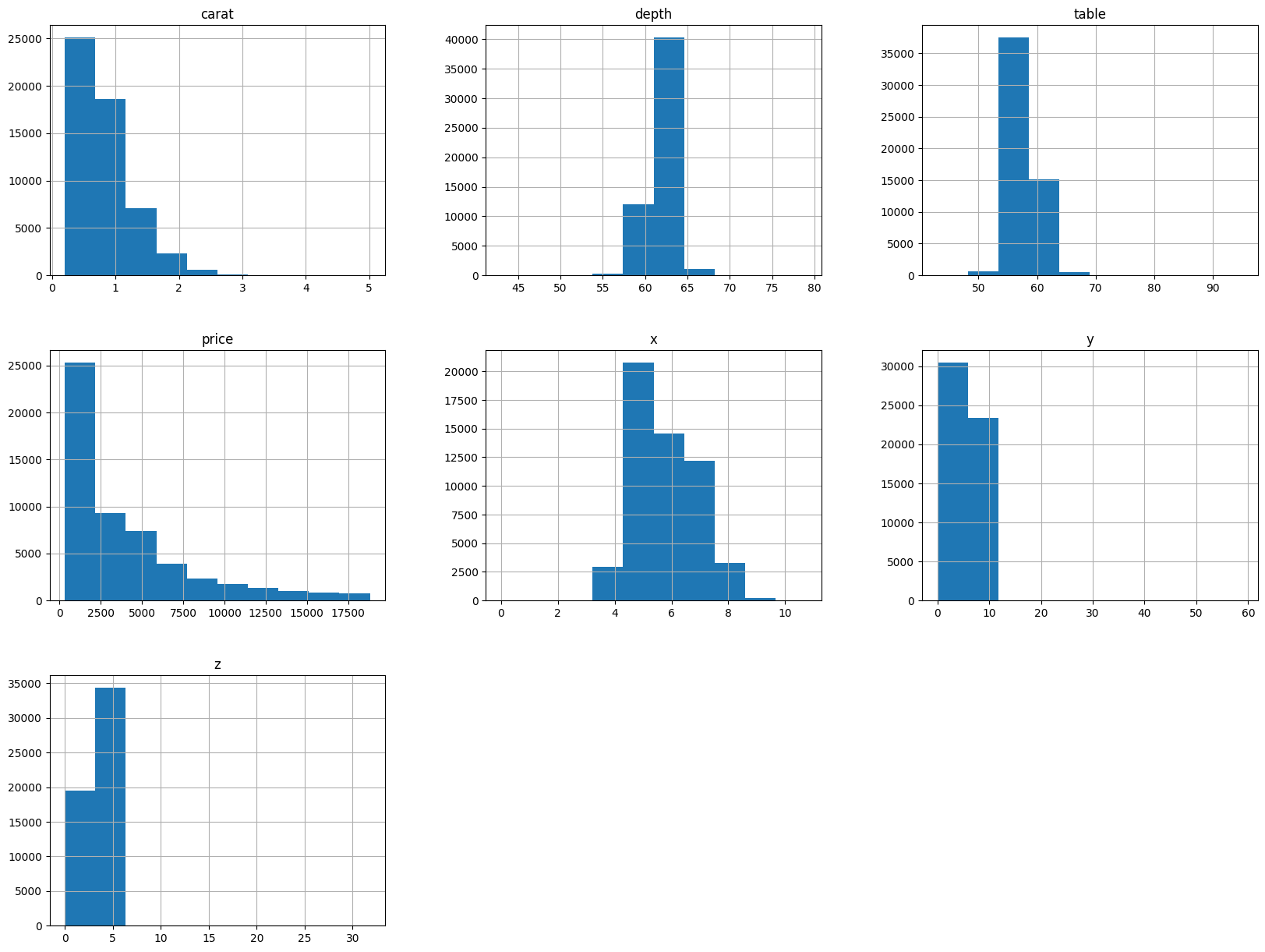
# Print 7 histograms, with each title describe shortly the distribution style of the data (e.g. right-skewed, clustered,...)
diamond_df.hist(figsize=(20, 15));

Hide code cell output

../../../_images/0489f505cbcb562067f5b023eafe854631ff4b1a5375f37736da640d68b0582b.png
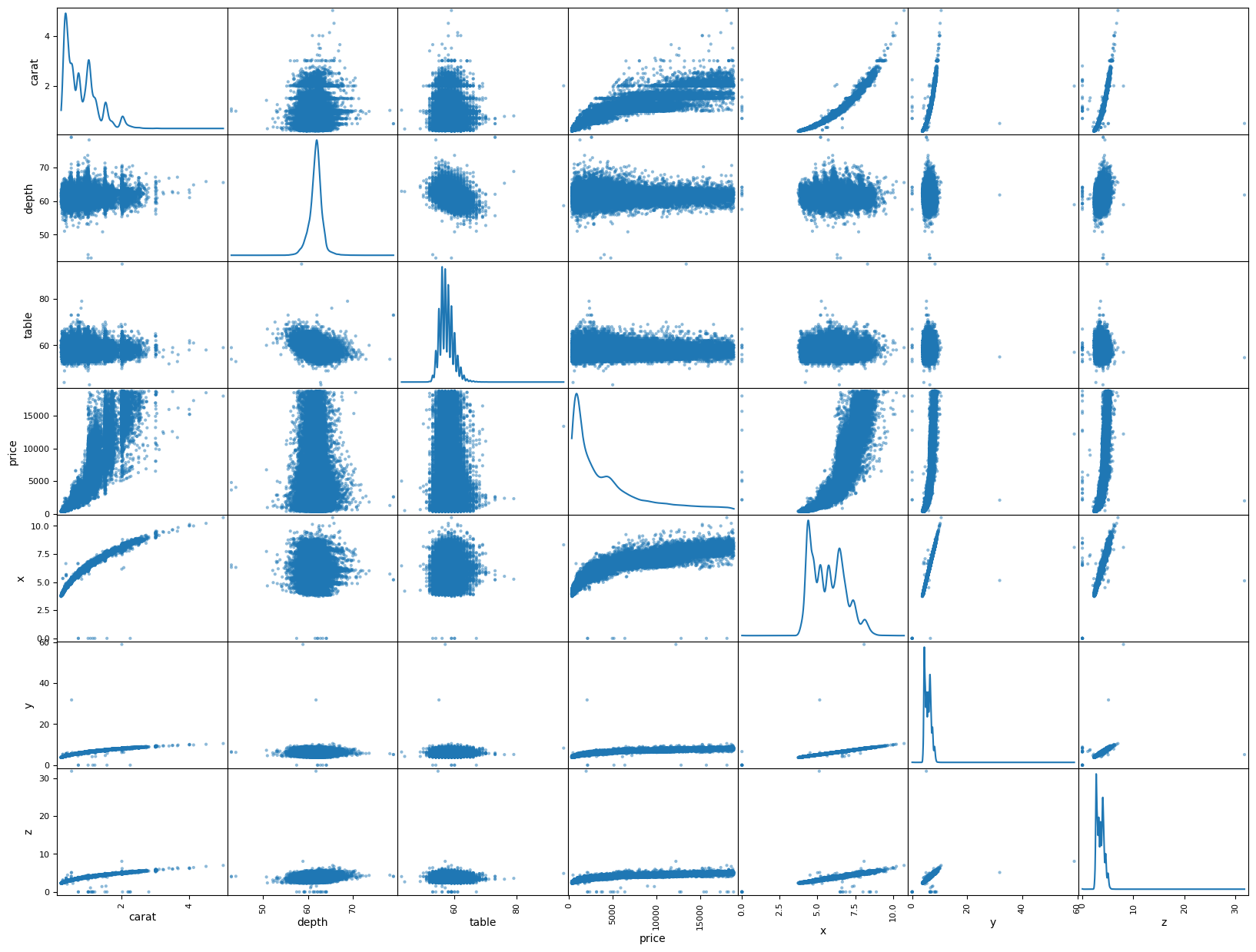
# The scatter matrix is a great way to visualize the relationships between multiple variables in a dataset.

from pandas.plotting import scatter_matrix
scatter_matrix(diamond_df, figsize=(20, 15), diagonal='kde');

Hide code cell output

../../../_images/d09295e1de3afd20bd440847c47bcd1388acb0a056fd1eb1c9ade41447501d98.png

Data Preparation#

Manipulate categorical variables#

diamond_df['cut'].unique(), diamond_df['color'].unique(), diamond_df['clarity'].unique()

Hide code cell output

(array(['Ideal', 'Premium', 'Good', 'Very Good', 'Fair'], dtype=object),
 array(['E', 'I', 'J', 'H', 'F', 'G', 'D'], dtype=object),
 array(['SI2', 'SI1', 'VS1', 'VS2', 'VVS2', 'VVS1', 'I1', 'IF'],
       dtype=object))
color_mapping = {'J': 0, 'I': 1, 'H': 2, 'G': 3, 'F': 4, 'E': 5, 'D': 6}
diamond_df.color = diamond_df.color.map(color_mapping)
clarity_mapping = {'I1': 0, 'SI2': 1, 'SI1': 2, 'VS2': 3, 'VS1': 4, 'VVS2': 5, 'VVS1': 6, 'IF': 7}
diamond_df.clarity = diamond_df.clarity.map(clarity_mapping)
cut_mapping = {'Fair': 0, 'Good': 1, 'Very Good': 2, 'Premium': 3, 'Ideal': 4}
diamond_df.cut = diamond_df.cut.map(cut_mapping)
diamond_df.describe()

Hide code cell output

carat cut color clarity depth table price x y z
count 53940.000000 53940.000000 53940.000000 53940.000000 53940.000000 53940.000000 53940.000000 53940.000000 53940.000000 53940.000000
mean 0.797940 2.904097 3.405803 3.051020 61.749405 57.457184 3932.799722 5.731157 5.734526 3.538734
std 0.474011 1.116600 1.701105 1.647136 1.432621 2.234491 3989.439738 1.121761 1.142135 0.705699
min 0.200000 0.000000 0.000000 0.000000 43.000000 43.000000 326.000000 0.000000 0.000000 0.000000
25% 0.400000 2.000000 2.000000 2.000000 61.000000 56.000000 950.000000 4.710000 4.720000 2.910000
50% 0.700000 3.000000 3.000000 3.000000 61.800000 57.000000 2401.000000 5.700000 5.710000 3.530000
75% 1.040000 4.000000 5.000000 4.000000 62.500000 59.000000 5324.250000 6.540000 6.540000 4.040000
max 5.010000 4.000000 6.000000 7.000000 79.000000 95.000000 18823.000000 10.740000 58.900000 31.800000

Eliminate disturbing values#

diamond_df = diamond_df.drop(diamond_df[diamond_df["x"]==0].index)
diamond_df = diamond_df.drop(diamond_df[diamond_df["y"]==0].index)
diamond_df = diamond_df.drop(diamond_df[diamond_df["z"]==0].index)

Eliminate values that > 99% of the rest#

diamond_df = diamond_df[diamond_df['depth'] < diamond_df['depth'].quantile(0.99)]
diamond_df = diamond_df[diamond_df['table'] < diamond_df['table'].quantile(0.99)]
diamond_df = diamond_df[diamond_df['x'] < diamond_df['x'].quantile(0.99)]
diamond_df = diamond_df[diamond_df['y'] < diamond_df['y'].quantile(0.99)]
diamond_df = diamond_df[diamond_df['z'] < diamond_df['z'].quantile(0.99)]
diamond_df.head(10)

Hide code cell output

carat cut color clarity depth table price x y z
0 0.23 4 5 1 61.5 55.0 326 3.95 3.98 2.43
1 0.21 3 5 2 59.8 61.0 326 3.89 3.84 2.31
3 0.29 3 1 3 62.4 58.0 334 4.20 4.23 2.63
4 0.31 1 0 1 63.3 58.0 335 4.34 4.35 2.75
5 0.24 2 0 5 62.8 57.0 336 3.94 3.96 2.48
6 0.24 2 1 6 62.3 57.0 336 3.95 3.98 2.47
7 0.26 2 2 2 61.9 55.0 337 4.07 4.11 2.53
8 0.22 0 5 3 65.1 61.0 337 3.87 3.78 2.49
9 0.23 2 2 4 59.4 61.0 338 4.00 4.05 2.39
10 0.30 1 0 2 64.0 55.0 339 4.25 4.28 2.73
diamond_df.describe()

Hide code cell output

carat cut color clarity depth table price x y z
count 51130.000000 51130.000000 51130.000000 51130.000000 51130.000000 51130.000000 51130.000000 51130.000000 51130.000000 51130.000000
mean 0.748505 2.965500 3.463974 3.117426 61.717375 57.349591 3561.244631 5.637999 5.641865 3.480219
std 0.406608 1.060319 1.679777 1.640241 1.285391 2.074312 3475.346374 1.035121 1.028587 0.637887
min 0.200000 0.000000 0.000000 0.000000 43.000000 43.000000 326.000000 3.730000 3.680000 1.070000
25% 0.390000 2.000000 2.000000 2.000000 61.100000 56.000000 921.000000 4.680000 4.690000 2.890000
50% 0.700000 3.000000 3.000000 3.000000 61.800000 57.000000 2273.000000 5.640000 5.650000 3.480000
75% 1.020000 4.000000 5.000000 4.000000 62.500000 59.000000 4997.000000 6.480000 6.480000 4.010000
max 2.070000 4.000000 6.000000 7.000000 65.500000 63.500000 18806.000000 8.300000 8.150000 5.000000
X = diamond_df.drop(['price'], axis=1)
y = diamond_df['price']
X = X.to_numpy()
y = y.to_numpy()
X.shape, y.shape

Hide code cell output

((51130, 9), (51130,))

Data for Training and Testing#

Split dataset into 80% training and 20% testing.

X_train = X[:int(X.shape[0]*0.8)]
y_train = y[:int(X.shape[0]*0.8)]
X_test = X[int(X.shape[0]*0.8):]
y_test = y[int(X.shape[0]*0.8):]

Normailize the data by subtracting the mean and dividing by the standard deviation.

xmean = np.mean(X_train, axis=0)
xstd = np.std(X_train, axis=0)
X_train = (X_train - xmean) / xstd
X_test = (X_test - xmean) / xstd
X_train.shape, X_test.shape, y_train.shape, y_test.shape

Hide code cell output

((40904, 9), (10226, 9), (40904,), (10226,))

Tranpose the data so that each row is a feature and each column is an example.

X_train = np.hstack([np.ones((X_train.shape[0], 1)), X_train])
X_test = np.hstack([np.ones((X_test.shape[0], 1)), X_test])
X_train.shape, X_test.shape, y_train.shape, y_test.shape

Hide code cell output

((40904, 10), (10226, 10), (40904,), (10226,))

Modeling#

Linear Regression Model#

N = X_train.shape[0]
n_epochs = 1000
m = 1000
learning_rate = 0.001

# No explicit bias term; the first column of X_* is ones to learn the intercept via W
theta = np.random.randn(10, 1)
losses = []

Training#

for epoch in range(n_epochs):
    for i in range(0, N, m):
        # Take a batch of data
        X_batch = X_train[i:i+m, :]
        y_batch = y_train[i:i+m].reshape(-1, 1)
        
        # Predict y_hat
        y_hat = X_batch @ theta
        
        # Compute loss
        loss = np.mean((y_hat - y_batch) ** 2)
        losses.append(loss)
        
        # Compute gradient
        gradient = 2 * X_batch.T @ (y_hat - y_batch)
        
        # Update weights
        theta -= learning_rate * (gradient / m)
        
    if (epoch + 1) % 50 == 0:
        print(f"Epoch {epoch + 1}/{n_epochs} - Loss: {losses[-1]}")

Hide code cell output

Epoch 50/1000 - Loss: 854690.2804881446
Epoch 100/1000 - Loss: 930888.7918352446
Epoch 150/1000 - Loss: 898086.575709949
Epoch 200/1000 - Loss: 865824.0643924325
Epoch 250/1000 - Loss: 837644.0411158183
Epoch 300/1000 - Loss: 813149.890785892
Epoch 350/1000 - Loss: 791850.0374682825
Epoch 400/1000 - Loss: 773313.9451640927
Epoch 450/1000 - Loss: 757169.9685266428
Epoch 500/1000 - Loss: 743097.4184975234
Epoch 550/1000 - Loss: 730819.5034467353
Epoch 600/1000 - Loss: 720097.2515056593
Epoch 650/1000 - Loss: 710724.2800891658
Epoch 700/1000 - Loss: 702522.2935133729
Epoch 750/1000 - Loss: 695337.2069441539
Epoch 800/1000 - Loss: 689035.8092394451
Epoch 850/1000 - Loss: 683502.8894749393
Epoch 900/1000 - Loss: 678638.7624560278
Epoch 950/1000 - Loss: 674357.1375643822
Epoch 1000/1000 - Loss: 670583.2830677389
# Validate the model, compute MSE on the test set
y_hat_test = X_test @ theta
test_loss_mse = np.mean((y_test - y_hat_test) ** 2)
print(f"Test MSE: {test_loss_mse}")

Hide code cell output

Test MSE: 1537577.661748432
# MAE
test_loss_mae = np.mean(np.abs(y_test - y_hat_test))
print(f"Test MAE: {test_loss_mae}")

Hide code cell output

Test MAE: 955.1460419805663
# Save the model parameters
np.savez(
    'weight.npz',
    x_mean=xmean,
    x_std=xstd,
    theta=theta
)
# Save the training and testing data
np.savez('data.npz', X_train=X_train, y_train=y_train, X_test=X_test, y_test=y_test)